Food Labels and Stickers for F&B: Compliance, Materials and Branding in One Label餐饮食品标签贴纸:合规、材质与品牌一步到位
Every week we print food labels for home bakers scaling into retail, cafes launching a bottled sauce, and factories that just failed a compliance check because their label was designed in fifteen minutes on a phone. Food label printing in Malaysia sits at an awkward intersection: it has to satisfy the Food Act 1983 and Food Regulations 1985, survive a fridge, a freezer or a hot kitchen, and still look good enough that someone picks your jar over the one next to it. Most SMEs solve one of those problems and forget the other two. Here is how to get all three right in one label.
What Malaysian food labels are expected to show
This is not legal advice — check with the relevant authority (MOH / KKM, or JAKIM for halal claims) for your product — but across the labels we produce for F&B clients, these elements come up most often:
- Product name and a true description — "chili sauce" is fine; "gourmet sauce" alone is not, if it does not describe what it is.
- Ingredient list in descending order by weight, including sub-ingredients of compound ingredients where relevant.
- Net weight or volume in metric units, sized proportionally to the label as required.
- Manufacturer or packer name and address — a PO box or Instagram handle is not sufficient.
- Date marking — production date and expiry, in a format that will not smudge or rub off.
- Storage instructions where the product needs refrigeration or has a shortened shelf life once opened.
- Halal logo only if you hold current JAKIM certification for that specific product — see below.
Leave space for all of this before you design anything decorative. We see brands design a beautiful label, then have to shrink the artwork by 30% at the last minute to squeeze in mandatory text — the label always looks worse for it.
Choosing a sticker material for food label printing in Malaysia
The material decision matters more than most F&B brands realise, because it determines whether the label still looks good after the product has actually been used.
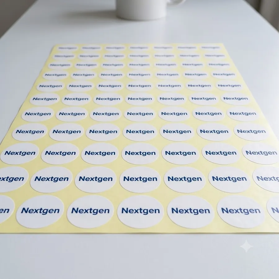
White PP (polypropylene) is our default recommendation for most food labels — it is waterproof, tears less easily than paper, and gives solid opaque coverage so colours print true even on a coloured or metallic container. Transparent (clear) film is the right call when you want the product itself visible through the label — jams, honey, infused oils and anything sold in a glass jar looks more premium with a clear label than a white one covering the jar.
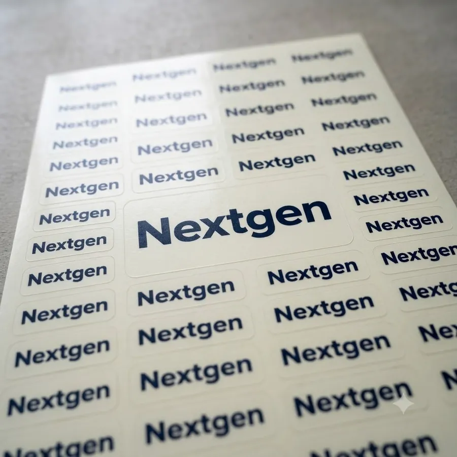
Beyond the base film, ask about lamination if the product goes into a fridge or freezer: condensation on an unlaminated paper label turns the ink into a smear within a day. If the label sits near heat, check the adhesive is rated for it — a standard adhesive can lift under consistent high temperatures. Tell us where the label will actually live and we will match the film and adhesive to it.
Halal labelling — the line most SMEs get wrong
The JAKIM halal logo is a certification mark, not a design element. It can only be printed once your specific product holds a valid halal certificate, and the artwork has to match JAKIM's approved format exactly — no resizing, recolouring or combining it with other graphics. If certification is still pending, print the batch without the logo and reprint once approved, rather than risk a claim you cannot back up. This is one of the most common reasons we see label batches rejected at retail level.
Making compliance look like a brand, not a barcode
A label that satisfies every regulation can still look like an afterthought. A few things consistently lift a compliance-first label into a brand asset: keep the product name and logo dominant, push the mandatory legal text to a smaller but still legible secondary block, use one accent colour across your whole range so a shopper can spot your product family from a distance, and keep the label size and shape consistent between flavours so a shelf full of your products reads as one brand.
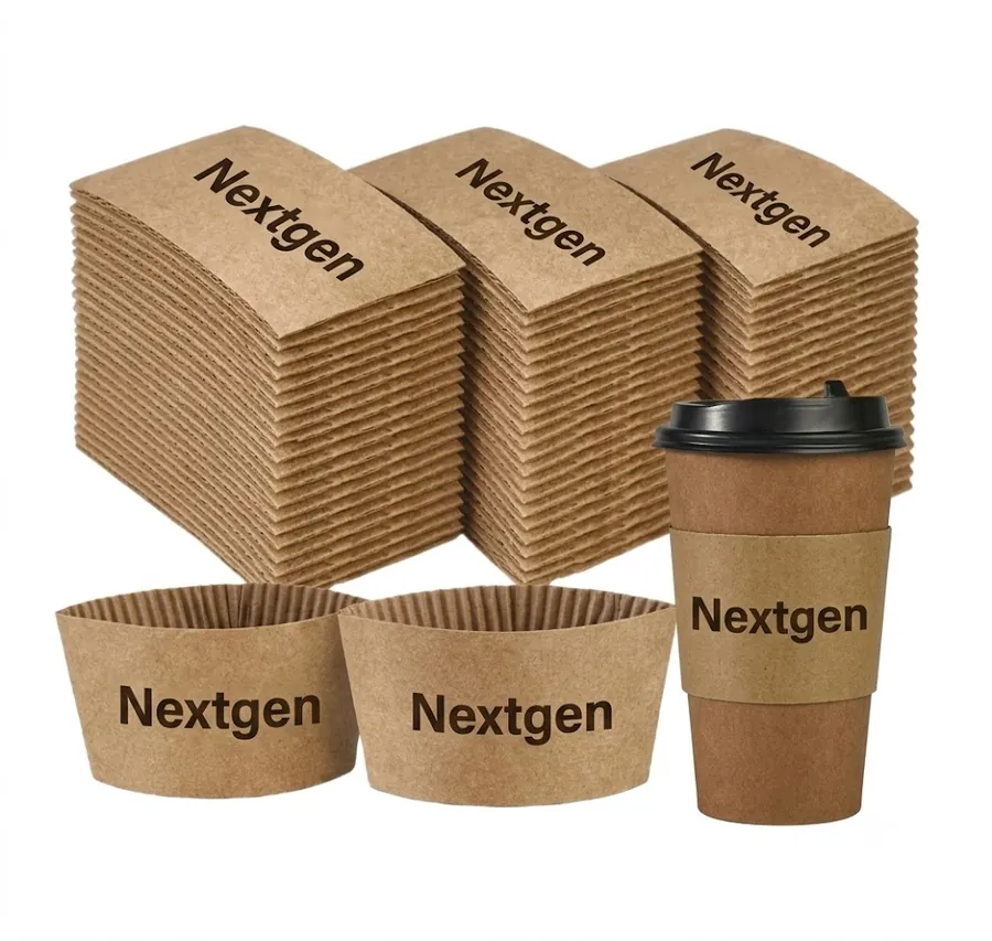
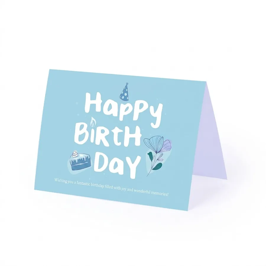
The same branding should extend past the jar. If you run a cafe or dessert counter alongside a packaged product line, matching your cup sleeves and cake cards to your label design makes the whole counter feel like one brand instead of a sticker on a jar and plain packaging everywhere else.
Print runs and reordering — the practical numbers
Digital label printing means you are not locked into a huge minimum order the way offset printing used to force you. A first order of a few hundred to a thousand labels per SKU is normal for a brand still testing a product, and the unit price drops meaningfully once you move into the low thousands — our print quantity pricing guide covers how that curve works. Keep your artwork file and colour references on hand so a reorder six months later matches the first batch exactly; a visibly different shade of green is a small thing customers notice.
Common mistakes we see
- No room left for a batch code or date stamp — leave a clear, unprinted zone for this even if applied by hand.
- Glossy laminate on a label handled with wet or oily hands — matte or soft-touch laminate resists fingerprints and smudging far better in a kitchen.
- Standard adhesive on a freezer product — it lifts at the corners within weeks; ask for a freezer-grade adhesive instead.
- Text sized for the design file, not the shelf — check the mandatory text is legible at arm's length, not just on a laptop screen.
- Different label stock between SKUs — mixing white PP and transparent without a design reason makes a range look inconsistent.
If you are choosing between materials for a wider product range, our sticker material guide goes deeper into how PP, PVC and paper stocks compare, and our F&B printing range covers the rest of what a food business typically needs. If you would rather send us your product and storage conditions and let us recommend the material, talk to us — quoting food labels is something we do daily.
我们每周都在为准备进军零售的自制烘焙店主、推出瓶装酱料的咖啡馆,以及因为标签是用手机十五分钟设计出来而合规检查不过关的工厂印制食品标签。马来西亚的食品标签印刷正好卡在一个尴尬的交叉点:既要符合《1983 年食品法令》与《1985 年食品条例》,又要经得起冰箱、冷冻库或热厨房的考验,还得好看到让人从一整排产品里挑中你的那一罐。大多数中小企业只解决了其中一个问题,另外两个就被忘记了。以下是如何一次把三件事都做对。
马来西亚食品标签应具备的内容
这不是法律意见——具体产品请向相关主管机关(卫生部 / KKM,清真标示则向 JAKIM)确认——但根据我们为餐饮客户制作的大量标签来看,以下几项内容最常出现,也最常因缺漏而被打回:
- 产品名称与真实描述——「辣椒酱」没问题;若「精品酱料」本身不能说明这是什么,就不合格。
- 按重量降序排列的成分表,若复合成分涉及子成分也应一并列出。
- 净重或净容量,以公制单位标示,字体比例需符合规定大小。
- 生产商或分装商名称与地址——邮政信箱或 Instagram 账号并不足够。
- 日期标示——生产日期与保质期或「此日期前食用」,字体印刷方式要经得起磨损而不模糊。
- 储存说明,若产品需冷藏或开封后保质期缩短。
- 清真标志,仅限该特定产品持有现行 JAKIM 认证时才可印上——详见下文。
在设计任何装饰元素之前,先把这些内容的空间预留出来。我们见过品牌先设计好一张漂亮的标签,最后才发现要把画面硬压缩 30% 才塞得下法定文字——标签因此永远显得局促。
为食品标签选对贴纸材质
材质的选择比多数餐饮品牌想象的更重要,因为它决定了产品被实际使用后,标签是否还能保持美观。
白色 PP(聚丙烯)是我们对多数食品标签的默认建议——防水、比纸质更耐撕,且遮盖力强,即使贴在有色或金属瓶身上也能显色准确。若希望产品本身透过标签露出——果酱、蜂蜜、浸泡油,或任何装在玻璃罐里的产品——透明贴纸会比白底标签更显高级。
除了底材本身,若产品会进冰箱或冷冻库,务必询问覆膜选项:未覆膜的纸质标签一旦遇上凝结水气,油墨一天内就会糊开。若标签靠近热源——炒锅台、咖啡机——也要确认胶水能耐受长时间高温;标准胶水在持续高温下容易翘边脱落。这些都不是我们随口一说,只要告诉我们标签实际会待在哪里(冰箱、冷冻库、货架、热厨房),我们就能据此匹配对应的底材与胶水。
清真标示——中小企业最常踩的红线
JAKIM 清真标志是一个认证标记,不是设计元素。只有当你的特定产品(不只是厨房,也不是「类似产品」)持有有效清真证书时,才能印上该标志,而且图样必须完全符合 JAKIM 核准的规格——不能缩放、改色或与其他图案组合。若认证仍在申请中尚未核发,先印无标志的版本,待核准后再改版重印,切勿冒险印上无法兑现的宣称。这是我们看到标签批次在零售端被拒收或扣留最常见的原因之一。
让合规标签也看起来像品牌,而不是条码贴纸
一张符合所有法规的标签,也可能看起来像临时应付的产物。以下几点能持续把一张「先求合规」的标签,提升为真正的品牌资产:让产品名称与 logo 保持视觉主导,把法定文字压缩到次要区块但仍需清晰可读,整个系列统一使用一个强调色,让顾客隔着距离也能认出你的产品家族,并让不同口味或款式的标签尺寸与形状保持一致,让整排产品看起来是一个品牌,而不是五个互不相关的东西。
这份品牌感也应延伸到罐子以外。若你在经营咖啡馆或甜品柜台,同时也有包装产品线,把杯套与蛋糕卡的设计对齐标签风格,能让整个柜台呈现同一个品牌,而不是罐子上贴了标签、其他包装却毫无关联。
印刷量与补货——实际数字
数码标签印刷不像以前的胶印那样必须一次下大量订单。品牌还在测试产品阶段,首批每款 SKU 印几百到一千张是常见做法,一旦单款进入数千张的量级,单价会明显下降——想了解这条曲线背后的逻辑,可参考我们的印刷数量与定价指南。请保留好你的设计档案与色彩参考,这样半年后补货时才能与首批完全一致;重印后颜色明显偏差,是顾客很容易察觉的小细节。
我们常见的错误
- 没有预留批号或日期戳的空间——即使目前是人手盖印,也要预留一块干净、未印刷的区域。
- 湿手或油手操作环境用了亮面覆膜——厨房环境下,哑光或触感膜远比亮面更能抵抗指纹与油污。
- 冷冻产品用了标准胶水——几周内边角就会翘起;应改用耐低温或永久型胶水。
- 字体大小只照顾设计稿,没照顾货架——确认最终校样在正常视距下法定文字仍清晰可读,而不只是在电脑屏幕上看着顺眼。
- 同一产品系列混用不同标签材质——若无设计上的理由,白 PP 与透明标签混用会让整个系列显得不统一。
若你要为更广的产品线挑选材质,我们的贴纸材质指南有更完整的 PP、PVC 与纸质对比;餐饮印刷系列也涵盖了标签以外,餐饮业者常需要的其他物料。若你想直接把产品、容器与储存环境告诉我们,让我们帮你判断材质,联系我们——食品标签的报价与打样是我们每天都在做的事。