Banner Design That Reads from 20 Metres: Layout, Fonts and Colour Rules20 米外也看得清的横幅设计:排版、字体与配色规则
We get a lot of banner artwork forwarded to us the day before an event, and most of it has the same problem: it was designed to look good on a laptop screen at 60cm, not to be read from the road at 20 metres. Good banner design is not a taste question — it is a distance-and-contrast calculation, and most SMEs never see the maths behind it. Here is the version we actually use when we push back on a client's artwork.
Start with the distance, not the canvas size
Before anyone touches a font, answer one question: from how far will this actually be read? A banner over a shoplot facade is read by pedestrians and slow traffic from 15–25 metres. A stage backdrop is read by a seated audience from 5–10 metres. A roadside banner on a fence facing a main road is read by moving vehicles from 30 metres or more, for about two seconds. Each distance needs a different minimum text size, and designing for the wrong one is the single biggest reason banners "look fine on screen, but nobody can read it on site."
The font-size maths
The rule of thumb we use, adapted from outdoor signage standards: for every 3 metres of viewing distance, your main headline needs roughly 2.5cm of cap height for a stationary reader — and closer to double that if the reader is walking or driving past rather than standing still and looking. Worked out for common distances:
- 5 metres (stage backdrop, close signage) — headline cap height at least 4–5cm, body text 2–3cm.
- 10 metres (shop frontage, walk-in customers) — headline at least 8–9cm, supporting text 4–5cm.
- 20 metres (roadside, carpark, across a field) — headline at least 15–17cm, which is roughly 120–140pt in design software. Anything smaller and the eye simply cannot resolve the letterforms fast enough at that distance.
- 30 metres+ (fast-moving traffic) — headline 20cm or larger, and no more than 4–6 words. You have about two seconds of attention; use it on one message.
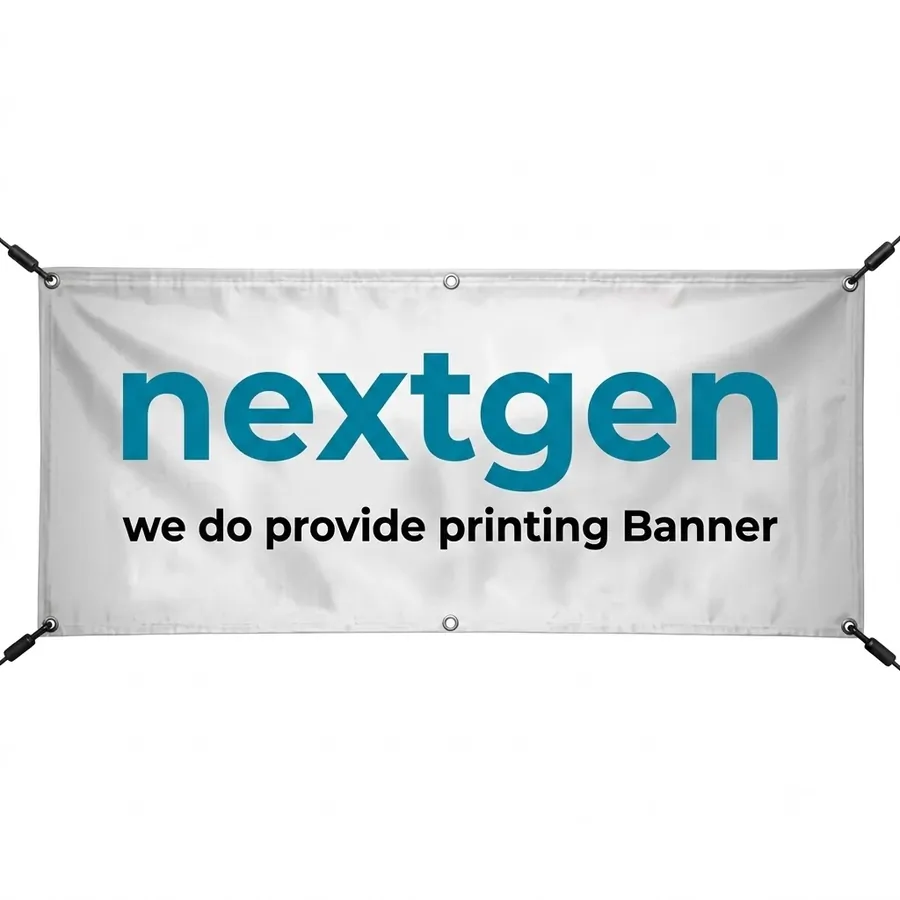
The practical fallout of this maths: a 20ft x 4ft roadside banner that tries to fit a company name, a tagline, three service bullets, a phone number and a QR code at readable sizes for 20 metres is mathematically impossible. Something has to be cut, and it should not be the headline.
Layout hierarchy: what goes where
Once the size maths sets your headline, the rest of the layout follows a fixed order of importance, top to bottom or left to right depending on orientation:
- The one thing you want remembered — brand name or offer, largest element on the banner, placed where the eye naturally lands first (top third for vertical banners, left third for horizontal ones read left-to-right).
- The proof or hook — one short supporting line: "Grand Opening", "50% Off This Weekend", "Now Open". No paragraphs.
- The action — phone number or WhatsApp number in a size that is still legible at a shorter "close-up" distance, since people who act on a banner usually walk closer first.
- Everything else — logo, address, social handles — smallest, bottom corner, present but not competing.
We tell clients to cover the artwork with one hand and ask "what's the one thing left visible I'd still understand?" If the answer isn't the headline, the hierarchy is wrong.
Colour and contrast rules that actually hold up outdoors
Screen colours and outdoor colours behave differently — sunlight washes out mid-tones and reflections kill low-contrast combinations that looked fine in Canva. A few rules we don't bend:
- Dark text on light background, or light text on dark background — always. Mid-tone on mid-tone (grey text on a coloured photo background, for instance) disappears in direct sun.
- Avoid red text on green, or green text on red — beyond being hard to read for anyone with red-green colour blindness (about 1 in 12 men), the two colours vibrate against each other at a distance instead of separating cleanly.
- Yellow-on-black or black-on-yellow for the single most urgent line — it is the highest-contrast, longest-visibility combination there is, which is why it's used on hazard signage worldwide. Use it sparingly, for one word or phrase, not the whole banner.
- Busy photo backgrounds need a solid colour panel behind the text, not text laid directly over the image. We see this fail constantly — a nice product photo with white text over a light patch of sky that becomes unreadable the moment the print settles into slightly different colour under sun versus the screen preview.
Match the message to the material
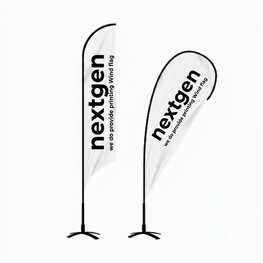
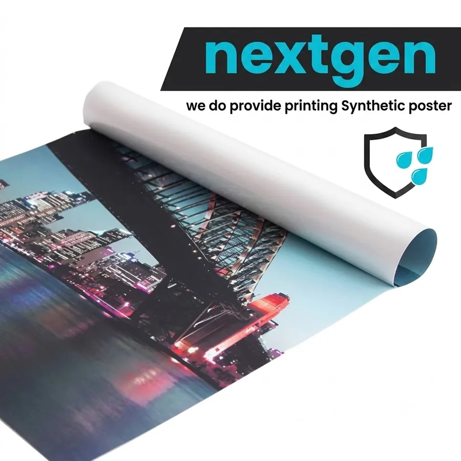
Design and material are not separate decisions — a banner meant to be read from far away in wind and rain needs a material that holds its printed colour and shape, not just artwork that's sized correctly. We cover the trade-offs between tarpaulin, synthetic and mesh in our banner material guide, but for design purposes the short version is: a static wall-mounted banner can carry more detail since it holds still and can be walked up to; a wind flag for an entrance or roadside needs an even simpler, mostly-vertical layout since it moves and twists in the breeze; and a synthetic poster for an indoor or sheltered spot can use finer detail and smaller text since viewing distance is shorter and more controlled.
Mistakes we see every week
The same handful of errors account for most of the "why can't anyone read our banner" complaints we field:
- Centring five lines of equal-sized text with no clear largest element — nothing draws the eye first.
- Using a decorative or script font for the headline. It looks elegant on screen and turns to mush at 15 metres.
- Cramming in every service the business offers instead of one message per banner. If you need to say five things, you need three banners run in rotation, not one banner saying five things badly.
- Ignoring bleed and safe margins, so text meant to be centred prints 1–2cm off after trimming — small on paper, obvious at banner scale.
- Approving artwork only on a phone screen. Print it at even 25% scale on A4 and view it from across the room before sending it to production.
Where we come in
We check every banner file we print against this exact distance-and-contrast logic before it goes to production — not to slow the job down, but because a banner that isn't read is money spent for nothing. If you have artwork ready or need it designed from scratch for the space it's actually going into, browse the full banner, board and display range or send us the dimensions and viewing distance and we'll tell you honestly if the layout will hold up.
我们常常在活动前一天才收到横幅稿件,而且大多数都犯了同一个毛病:这份稿件是为了在 60 公分外的笔电屏幕上好看而设计的,不是为了在 20 米外的马路上被看清。好的横幅设计不是审美问题,而是一道距离与对比度的计算题,只是大多数中小企业从没见过这道题背后的算法。以下是我们真正用来跟客户的稿件「据理力争」时所用的版本。
先算距离,再谈画布尺寸
在动手调字体之前,先回答一个问题:这份稿件实际上会被从多远看到?店面上方的横幅,行人与慢速车流会从 15–25 米外看到;舞台背景板,坐着的观众会从 5–10 米外看到;面向主干道、挂在围栏上的路边横幅,则是被行驶中的车辆从 30 米以上、只用约两秒钟看到。每一种距离都对应不同的最小字号,用错距离设计,正是横幅「屏幕上看没问题,现场却没人看得清」的头号原因。
字号的算法
我们采用的经验法则,改编自户外招牌的标准:每 3 米观看距离,主标题大约需要 2.5 公分的字高(针对站定不动的读者),如果读者是走路或开车经过而非站定细看,字高要再乘将近一倍。按常见距离换算:
- 5 米(舞台背景板、近距离招牌)——标题字高至少 4–5 公分,内文 2–3 公分。
- 10 米(店面招牌、走入型顾客)——标题至少 8–9 公分,辅助文字 4–5 公分。
- 20 米(路边、停车场、隔着一片空地)——标题至少 15–17 公分,换算成设计软件大约是 120–140pt。再小,眼睛在这个距离就来不及辨识字形。
- 30 米以上(快速车流)——标题 20 公分以上,且不超过 4–6 个字词。你只有约两秒的注意力,用在一句话上就好。
这道算法的现实结果是:一幅 20 尺 x 4 尺的路边横幅,想在 20 米可读的字号下同时塞进公司名、标语、三项服务卖点、电话号码与二维码,在数学上根本不可能。必须有取舍,而且不该牺牲标题。
排版层级:什么该放在哪里
字号算法定下标题大小之后,其余版面就依照固定的重要性顺序排列,直式由上到下、横式由左到右:
- 你最想让人记住的一件事——品牌名或优惠,是版面最大的元素,放在视线自然落点(直式横幅放上三分之一,横式由左至右阅读的放左三分之一)。
- 证据或钩子——一句简短的辅助句:「盛大开幕」「本周末五折」「现已开业」,不要写成一段话。
- 行动方案——电话或 WhatsApp 号码,字号要在「走近一点」的距离下仍清晰可读,因为真正被横幅打动而行动的人,通常会先走近查看。
- 其余信息——标志、地址、社交账号——字号最小,放在角落,存在但不抢戏。
- 深底浅字,或浅底深字——永远优先。中间色配中间色(例如彩色照片背景上放灰色文字),在艳阳下会直接消失。
- 避免红字配绿底,或绿字配红底——除了对约十二分之一的男性色盲/色弱人士不友善之外,这两色在远距离会互相「振动」而不是干净分离。
- 黄底黑字或黑底黄字留给最紧急的那一句话——这是对比度与可视距离都最高的配色组合,也是全球危险标示采用它的原因。少量使用,用在一个词或短句,不要整幅横幅都用。
- 照片背景较杂乱时,文字后面要垫一块实色色块,而不是直接把字压在照片上。这个错误我们看得太多——好看的产品照配上白字,压在照片里一小片浅色的天空上,结果印出来的颜色跟屏幕预览有微妙差异,字就整个糊掉。
- 五行文字大小一致又置中排列,没有一个最大的元素带领视线。
- 标题用装饰字体或手写体,屏幕上看很雅致,到 15 米外就糊成一团。
- 把公司所有服务项目都塞进一幅横幅,而不是一幅一个讯息。如果有五件事要讲,需要的是轮播的三幅横幅,而不是一幅讲五件事却讲不清楚的横幅。
- 忽略出血与安全边距,导致原本要置中的文字裁切后偏移 1–2 公分——在纸上看很小,放大到横幅尺寸就很明显。
- 只用手机屏幕审稿。至少用 A4 打印 25% 比例,站到房间另一端看一眼,再送印刷。
我们常请客户用手遮住稿件,只留一处,问自己:「剩下这一处,我还看得懂在讲什么吗?」如果答案不是标题,代表层级排错了。
经得起户外考验的配色规则
屏幕上的颜色和户外的颜色表现不一样——阳光会洗淡中间色调,反光也会让在 Canva 上看起来还行的低对比配色瞬间失效。以下几条我们不会妥协:
让讯息配对材质
设计与材质从来不是两件独立的事——一幅要被远距离看清、又要经得起风吹雨打的横幅,除了字号排对,材质也要撑得住。材质的取舍我们在横幅材质选择指南里有详细说明,但就设计而言简单版是:固定挂墙的横幅因为不会晃动、也能走近细看,可以承载较多细节;入口或路边用的风旗因为会随风扭动,版面要更简单、以直式为主;室内或有遮蔽处用的合成纸海报因为观看距离更短、更稳定,可以用更细的细节与更小的字。
我们每周都会看到的错误
「为什么没人看得懂我们的横幅」这类抱怨,几乎都出自同样几个错误:
我们能帮上什么忙
每一份送印的横幅稿件,我们都会先按这套距离与对比度的逻辑检查一遍——不是为了拖慢流程,而是因为一幅没人看得懂的横幅,等于白花钱。如果你已经有稿件,或需要针对实际摆放空间重新设计,欢迎浏览完整的横幅、板材与展示架系列,或把尺寸与观看距离告诉我们,我们会如实告诉你这个版面撑不撑得住。