Year-End Sale Banners and Signage That Make Discounts Visible年终大促横幅与标示:让折扣一眼被看见
Every year-end sale banner we print in November and December runs into the same problem: too many offers fighting for one glance. A driver or a passing shopper gets about two seconds to read a shopfront banner before they're past it, and a year end sale banner that tries to say "up to 70% off storewide, buy 1 free 1, plus free gift with purchase" usually ends up saying nothing. The fix is almost always to cut, not to add.
Lead with one number, not five
Pick the single offer that's easiest to believe and easiest to act on — a flat percentage, a flat price, or a clear "buy X get Y" — and make it the only thing anyone reads from the road. The exact terms, excluded items and fine print belong on a smaller poster near the entrance or a card at the till, not on the big banner. We've watched clients cut a five-line banner down to one number and one deadline and see foot traffic pick up within the same week, simply because the message now reads in the two seconds it actually has. If you genuinely have several good offers — storewide percentage off plus a bundle deal plus a gift with purchase — rotate them across the sale period instead of stacking them on one piece of signage; a fresh headline in week two also gives regulars a reason to walk past again.
What goes where: banner, window poster, A-stand and wobbler
A year-end sale usually needs four different pieces, and each one is doing a different job. Mixing them up — cramming the full offer onto a wobbler, or leaving the A-stand blank — wastes the piece that's best placed to convert.
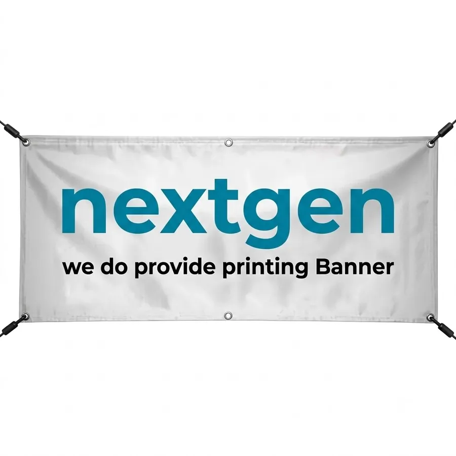
- Shopfront banner — the long-range piece. One headline number, your shop name, and nothing else needs to be legible from 15–20 metres. We covered the exact layout rules in our banner design guide, and the same rules apply doubly during a sale, when attention is already split between every other shop doing the same thing.
- Window poster — the close-range piece. This is where the terms, the date range, and a second or third offer can live, because someone standing at the glass has time to read a paragraph.
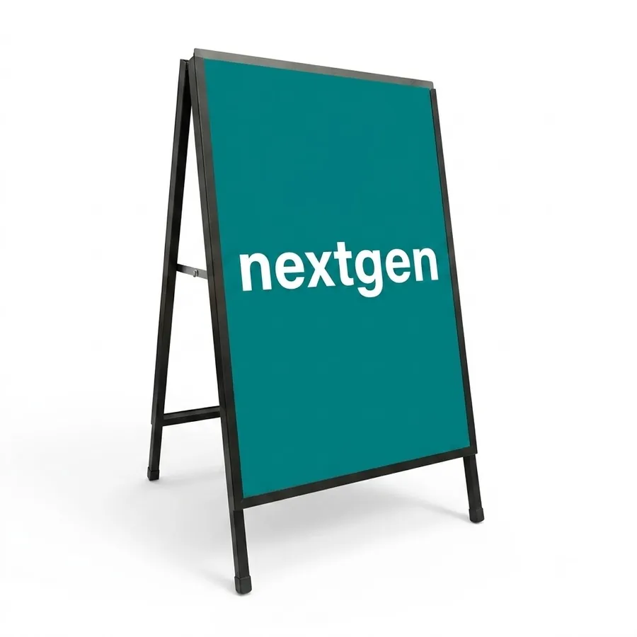
- A-stand — placed right at the entrance or at the edge of the five-foot way, it catches people who have already slowed down to look. Keep it to the headline offer again, not the fine print — it's a second chance to land the same message, not a place for new information.
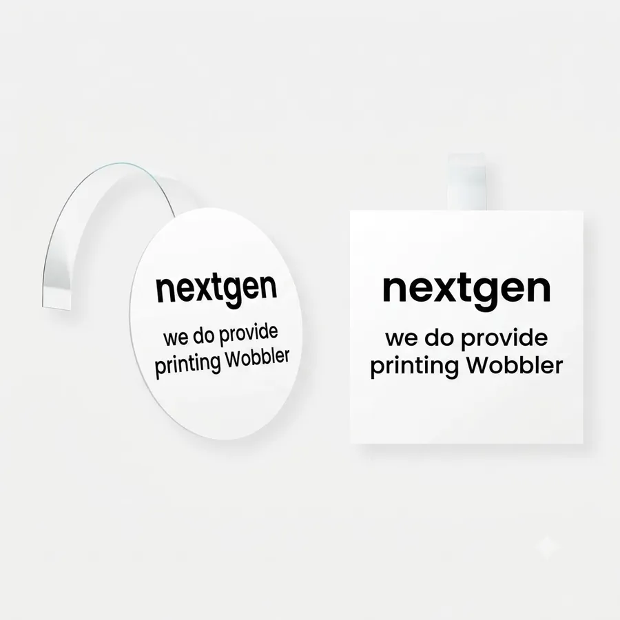
- Shelf wobbler — the last-metre piece, used inside the shop at the exact rack or counter where the discounted item sits, nudging a decision that's already 90% made.
Why synthetic paper survives a two-week sale
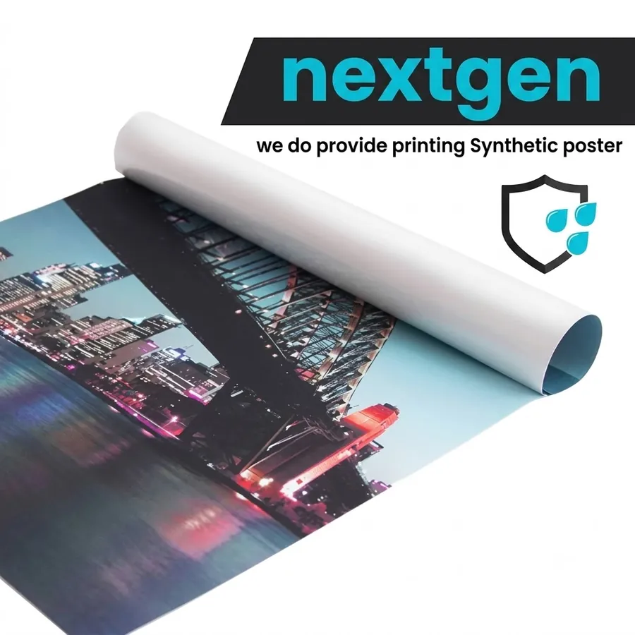
Most year-end sales run two to three weeks, through at least a few days of Malaysian rain, and ordinary paper posters show it: corners curl, ink runs at the edges, and by the second week a poster that looked sharp on day one looks like it's been there for a month — which quietly tells shoppers the sale has been running longer than it has, or worse, that it's already stale. Waterproof synthetic paper costs a little more per piece but doesn't curl, tear or fade the same way, so the window poster still looks like it went up yesterday on the day you take it down. For anything indoors and under two weeks, ordinary paper is fine and cheaper; for anything facing the street, facing the sun, or running past the two-week mark, synthetic earns its price difference.
Timing it so it isn't a last-minute scramble
The order spike we see every year lands in the last week of November, which is also the week our turnaround is slowest because everyone else is ordering the same thing at once. If you already know your sale dates — and most shops running 11.11, 12.12 or a year-end clearance do — lock the headline offer and the artwork at least two weeks before launch. That gives enough room for one round of corrections and still leaves the banner and window poster printed and hung before the first weekend of the sale, which is usually when foot traffic peaks. Shops that order the week they want to launch almost always end up compromising on material, size or finishing just to hit the date.
- Confirm the one headline offer and the exact sale dates first — everything else follows from that.
- Order the banner and A-stand at the same time as the window poster so they arrive and get hung together.
- Add the shelf wobbler last; it's the cheapest and fastest piece to reorder if the promotion extends.
Where to start
If you've got a sale date and one offer in mind, talk to us about sizing and material for the full set — banner, poster, A-stand and wobbler — so everything is printed and hung before the first weekend, not during it.
每年 11 月到 12 月,我们印的年终大促横幅几乎都栽在同一个问题上:太多优惠挤在一张图里,抢着被看一眼。开车经过或路过的顾客,看一张店面横幅的时间大概只有两秒,而一张想同时说「全场低至3折、买一送一、还送礼品」的年终大促横幅,结果往往是什么都没说清楚。解决办法几乎永远是减,不是加。
只讲一个数字,不要讲五个
挑一个最容易相信、也最容易让人马上行动的优惠——一个固定折扣、一个固定价格,或是清楚的「买X送Y」——让它成为路人唯一能读到的信息。具体条款、不适用项目和细则,应该放在入口附近较小的海报或柜台的卡片上,不是放上大横幅。我们见过客户把五行字的横幅砍成只剩一个数字和一个截止日期,结果同一周人流就开始回升,原因很简单:信息终于能在它真正拥有的那两秒内被读完。如果你确实有几个不错的优惠——全场折扣、组合优惠、再加买满送礼——不如在促销期间轮流上架,而不是全部挤在同一张物料上;第二周换一个新主题,也能让熟客多一个理由再经过一次。
横幅、海报、A字牌与摇摇牌:各自该放什么
一场年终大促通常需要四件不同的物料,每一件扮演的角色都不一样。把它们的内容搞混——把完整优惠硬塞进摇摇牌,或是让A字牌空着——等于浪费了最适合促成成交的那一件。
- 店面横幅——远距离的物料。只需要一个标题数字和店名能在15至20米外看清楚,其他都不需要。我们在横幅设计指南里写过具体的排版规则,促销期间这些规则更要双倍遵守,因为每家店都在抢同一批注意力。
- 橱窗海报——近距离的物料。站在玻璃前的顾客有时间读一段文字,所以条款、日期和第二、第三个优惠可以放在这里。
- A字牌——放在入口或五脚基边缘,接住那些已经放慢脚步在看的人。内容还是只放主打优惠,不要放细则——它是让同一条信息被再看一次的机会,不是放新信息的地方。
- 摇摇牌——最后一米的物料,放在打折商品所在的货架或柜台,推一推那个已经九成确定的购买决定。
为什么合成纸能撑过两周的促销
大部分年终促销会跑两到三周,期间少不了几天马来西亚的雨季天气,普通纸海报很快就会露底:角落卷边、边缘渗墨,到第二周,第一天看起来还很新的海报,就会让人觉得已经挂了一个月——无声地告诉顾客,这场促销开始得比实际更早,甚至已经过时。防水合成纸每张贵一点,但不容易卷边、撕裂或褪色,撤下的那天看起来还跟刚挂上去一样新。如果是室内、两周以内的促销,普通纸便宜又够用;只要是面向街道、晒到太阳,或是超过两周的促销,合成纸多花的那点钱就值回来了。
提前安排,别等到最后一刻才下单
我们每年看到的订单高峰都落在11月最后一周,偏偏那也是我们出货最慢的一周,因为大家都在同一时间下单。如果促销日期已经定了——大部分做双11、双12或年终清货的店家都是如此——至少提前两周把主打优惠和稿件定下来。这样还留得出一轮修改的时间,横幅和橱窗海报也能在促销第一个周末(通常是人流最高峰)之前印好挂好。等到想开卖那一周才下单的店家,几乎都会被迫在材质、尺寸或后制上妥协,只为了赶上日期。
- 先确定唯一的主打优惠和确切的促销日期——其他一切都从这里开始安排。
- 横幅、A字牌和橱窗海报同时下单,才能一起到货、一起挂上。
- 摇摇牌最后再订;如果促销延长,它是最便宜、最快能加印的一件。
从哪里开始
如果促销日期和主打优惠已经想好了,联系我们,我们帮你把横幅、海报、A字牌和摇摇牌一整套的尺寸与材质定下来,让一切在促销第一个周末之前就印好挂好,而不是边卖边补。